Holiday Campaign 2024
lululemon
Design lead for visual identity system, asset development and global guidelines for lululemon's 2024 holiday gifting campaign.


CD: Patrick Young
AD: Fernanda Arreguín
Sr GD: Ryan Kearns, Zander Geddes
GD: Kayli Hendricks, Camila Burbano del Alcazar, Taylor Crane
Sr Copy: Gabrielle Elliot
Copy: Emily Angus, Rik Klingle-Watt
Photo: Sam Nixon, Garette Nakarato
DP: Madison McKamey
Video Editors: Stephen Leck, Chadderton Thornton
Creative Ops: Louise Bielby, Wendy Samson
Styling: Hilary Russell, Clare Seddon, Holly Cooper
Casting: Amanda Munoz
lululemon wanted to create a campaign with a strong focus on themes of joy, togetherness, wellbeing and memorable moments during the holiday season.
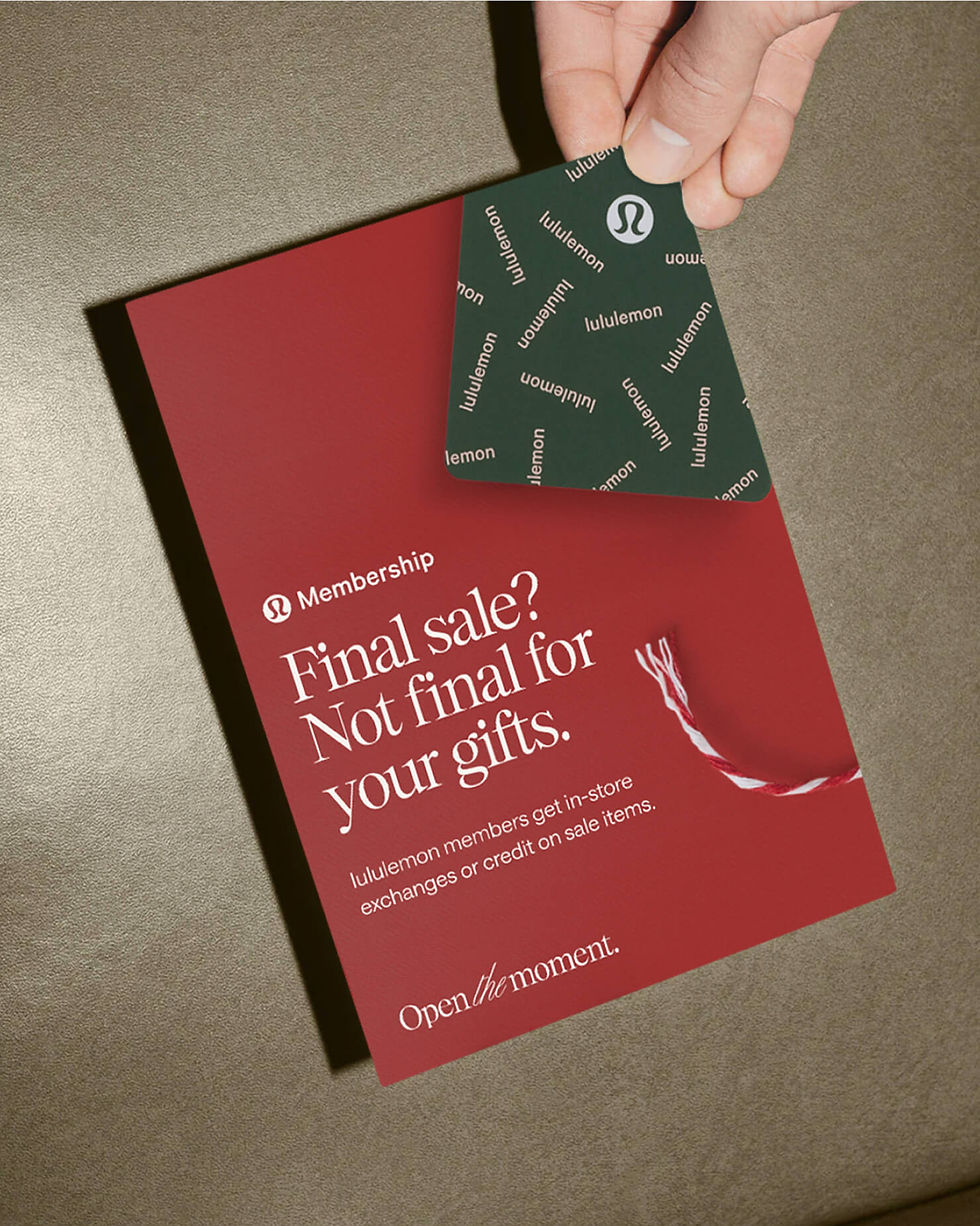
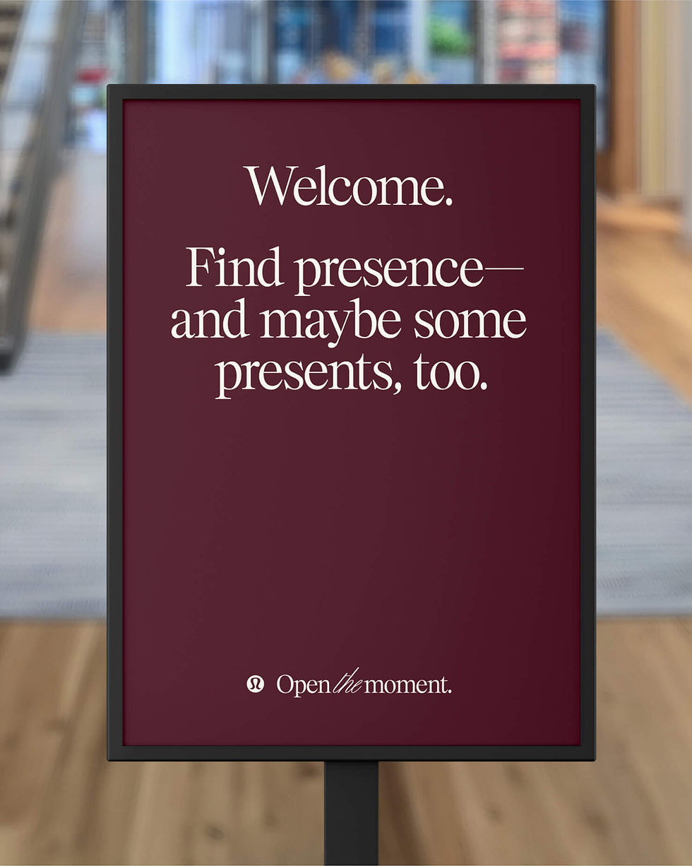
With our key message of ‘Open the moment’, we invited guests to consider that the real gift was not the leggings or the jacket they received; but instead the feeling you get when you’re wearing them, and you’re so comfortable and distraction free, that you’re open to experience each moment as it happens.
Through the combination of evocative photography, inspiring video, and a considered visual identity system, we were able to establish a powerful sense of comfort and nostalgia for guests while they took on the holiday season; and at the same time, lead the brand's approach to gifting campaigns into new territory.
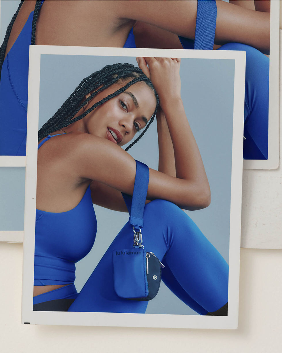


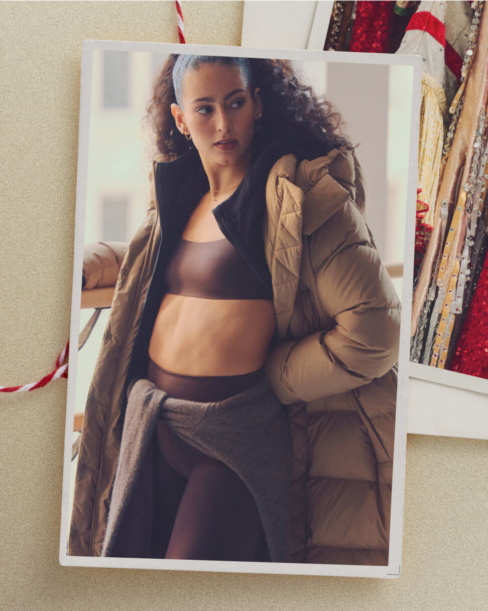

Striking a delicate balance between captivating allure and subtle charm, our aim was to evoke the essence of memory-making through intentional use of tactile elements, encouraging guests to pause and savour the beauty of each moment.


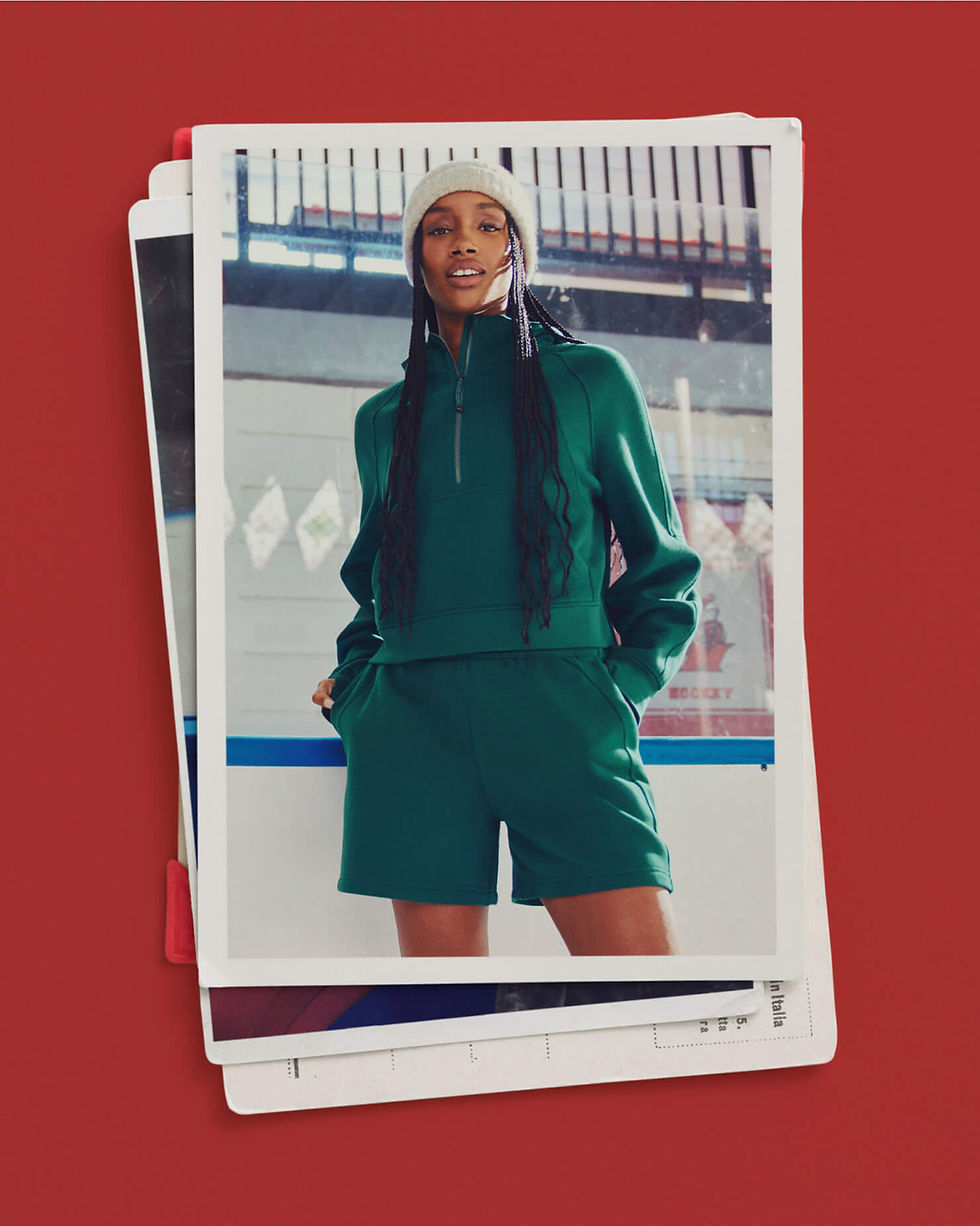

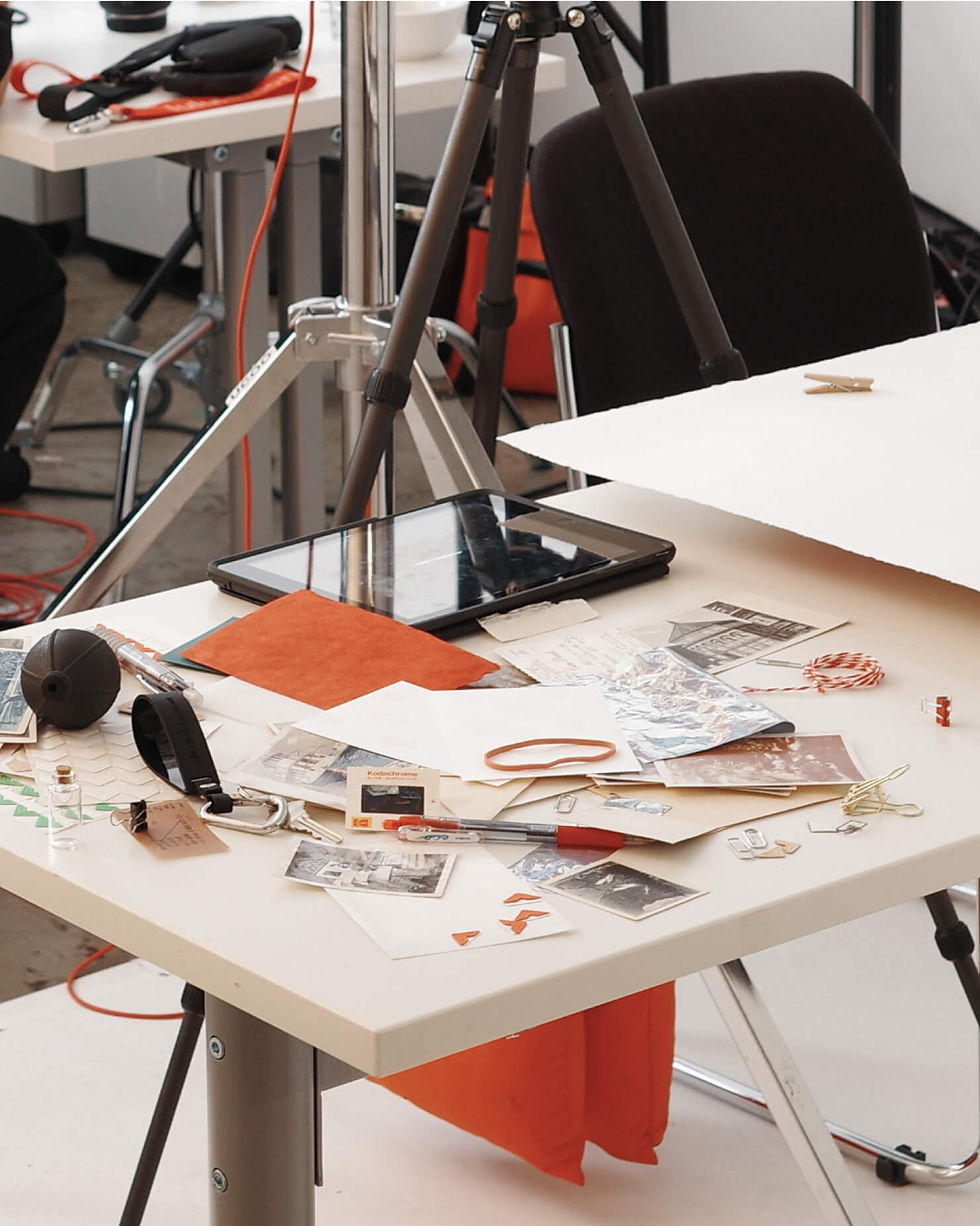
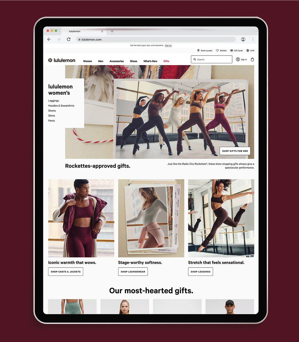
In order to provide enough variations to maintain a sense of newness—and consistency—throughout the 10-week campaign, more than 30 unique compositions with up to 5 different background options were built into templates that the team could use in combination with any photo from the campaign.


The pairing of KH Giga and Carta Nueva creates a mark that instantly feels timeless and familiar, with a nod to the festivity of the season.
When paired with the product inspired colour palette, tactile templates and campaign photography, they form the foundation of the campaign’s visual identity.


For the fullest expression of the campaign messaging, we developed a type treatment that allowed us to create compositions that could amplify key messaging through a festive lens.


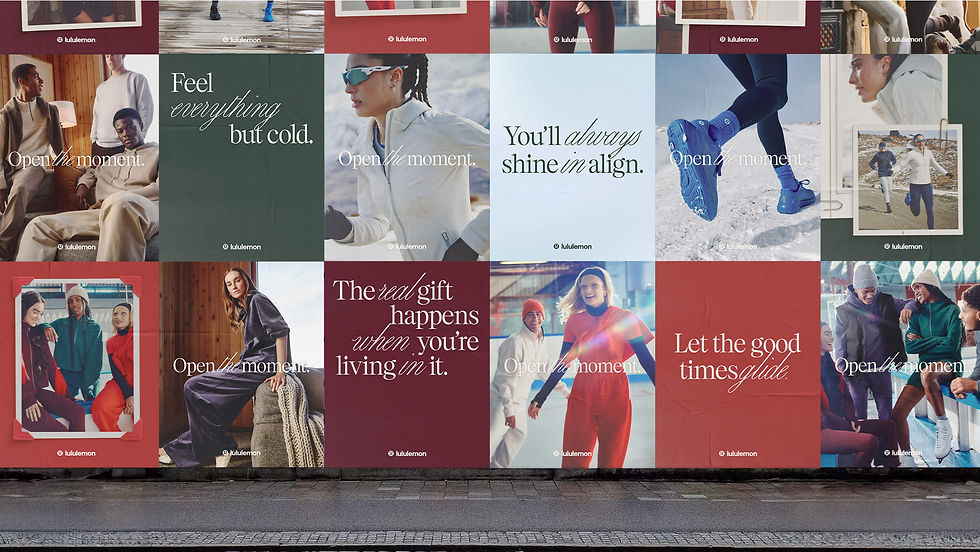
The system and its elements were designed so that they could be dialled up, or down, depending on the placement and intention of the execution.


thank-you for your patronage!

